Mobile App Design
Personal Data Tracking Software
CCL is a data company focused on the science of pregnancy, who had developed a more complex tracking app than was available in the current market. Although their app offered better data, they were lacking a way to connect to a wider market and to make women feel comfortable when using their app.
Product Design for a Menstrual Cycle Tracking and Pregnancy App
Couple to Couple League (CCL) needed a major design update to their tracking app to reach a wider audience and update their user journeys for a better user experience. They focus on the medical side of helping women get pregnant though tracking certain symptoms to understand their cycle.
Overview
CCL is an app meant to track menstrual and ovulation cycles with the goal of helping everyone with their monthly tracking needs. Whether a person wants to become pregnant, is hoping to avoid pregnancy, or just wants to track their menstrual cycle the CCL app will help.
- Role: Lead Designer, Part of a Cross-Functional Team
- Sector: SaaS, B2C, FemTech, Period Tracker App
- Time: 12 Weeks
- User Group: Women aged 25-45 looking to become pregnant, avoid pregnancy, or track their menstrual cycle
- Tools: Figma, Adobe Illustrator, Miro, IOS, Android
Vision and Goals
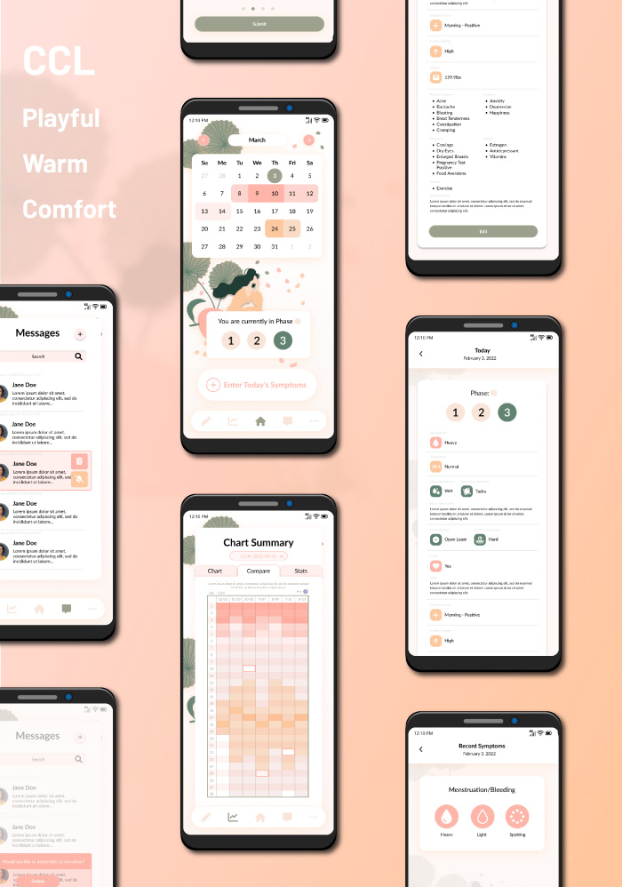
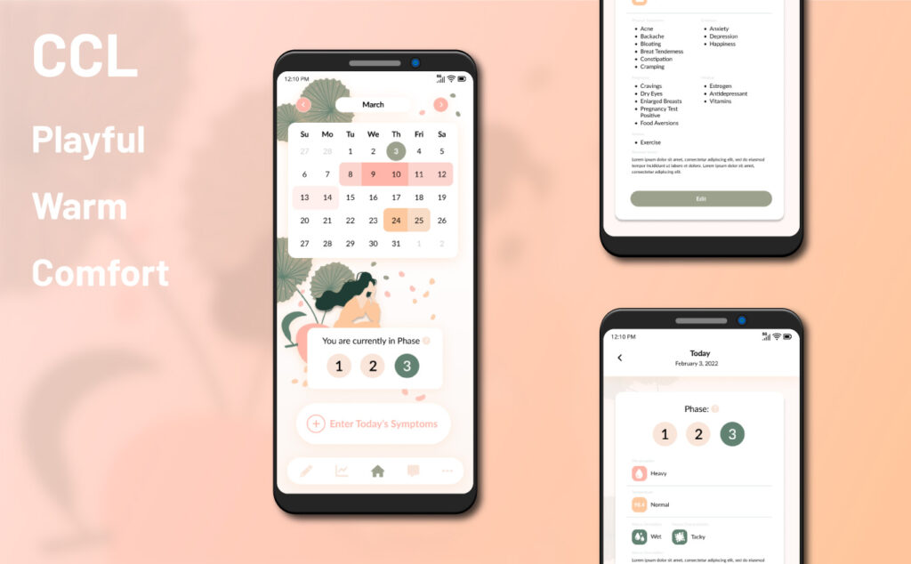
The goal of this design was to bring out a playful, warm, and comfortable side to the menstrual cycle. They wanted to help those with periods find peace in an app that can track it for you.
The client wished to avoid something too juvenile or something that looked too much like other period tracking apps on the market. They also needed the app to work for several different user groups. Although their primary user group is women looking to become pregnant, they also wanted their app to work for women looking to avoid pregnancy via tracking, and those who just wish to track their cycle.
CCL already had an existing app, and an existing client base, so it was also important to update functionality without confusing existing users. Their existing app was lacking any styling, as they had only been using it with user groups to find data and test their system.
Main Takeaway: a new, playful, comfortable, and feminine style was needed immediately for their product.
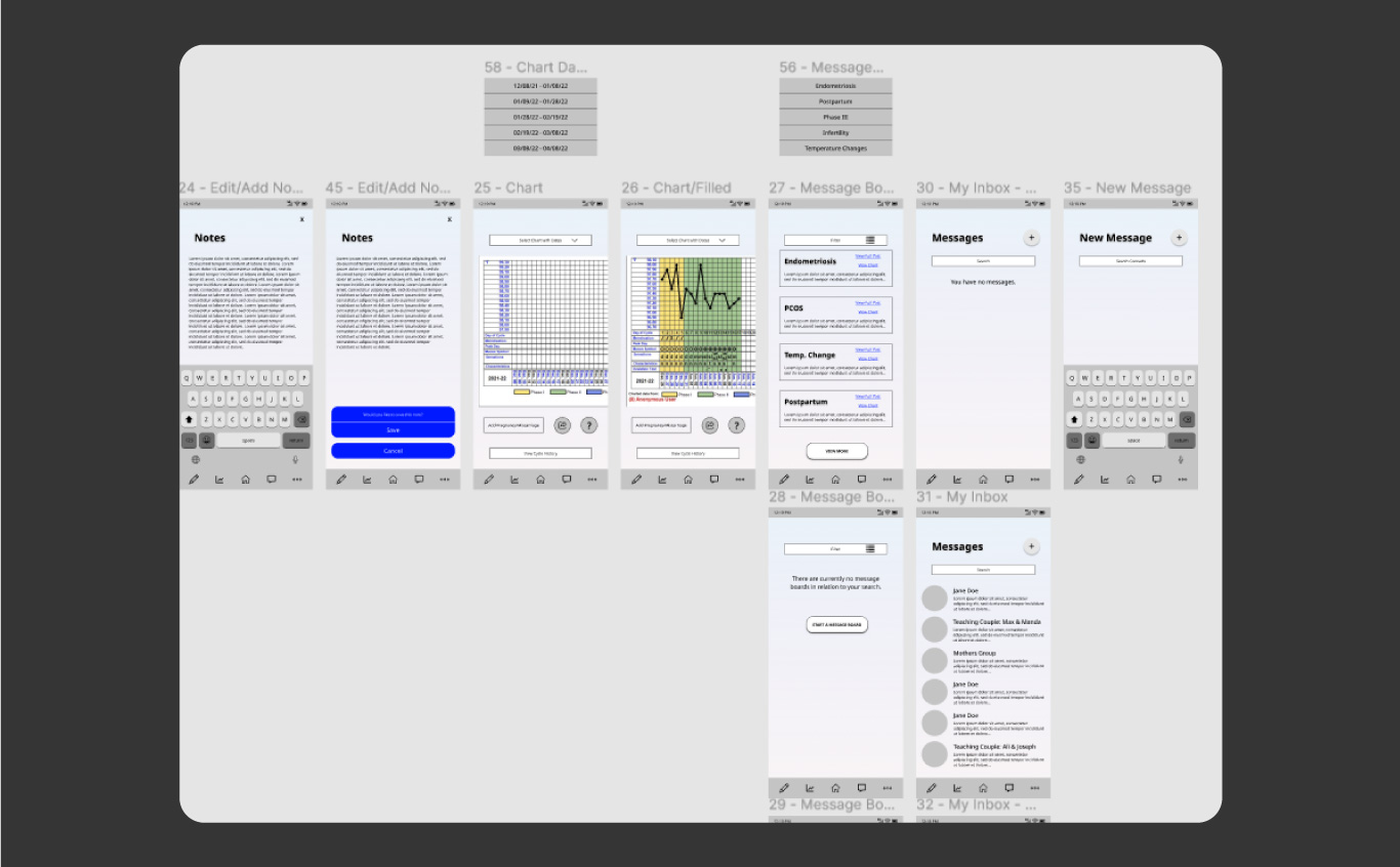
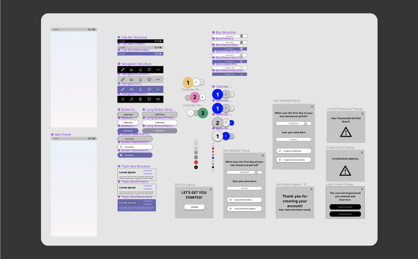
Lofi Mockups and Wireframes
CCL had an existing app with a basic design. As such our team needed to work through the existing app to create an overall wireframe. The app itself has several different important sections and uses that were pointed out to us by the client.
The wireframe was broken up into the various flows we would need to design. Lofis were created for each page and component.
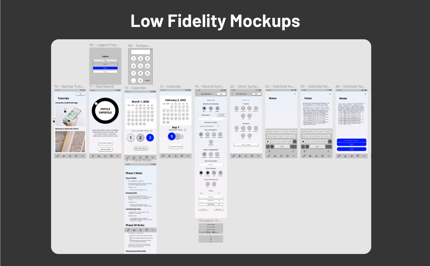
The lofis then needed to be revised to find the best user flow for each of the sections of the app. We utilized the information from the client and interviewed several users to find the best flow and then implemented it into the lofis.
The flows continued to be adjusted throughout the process.
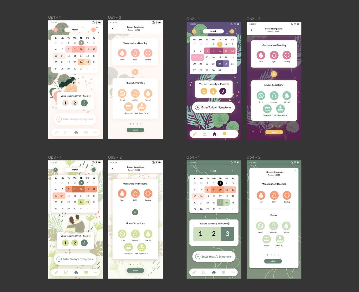
Design Iterations
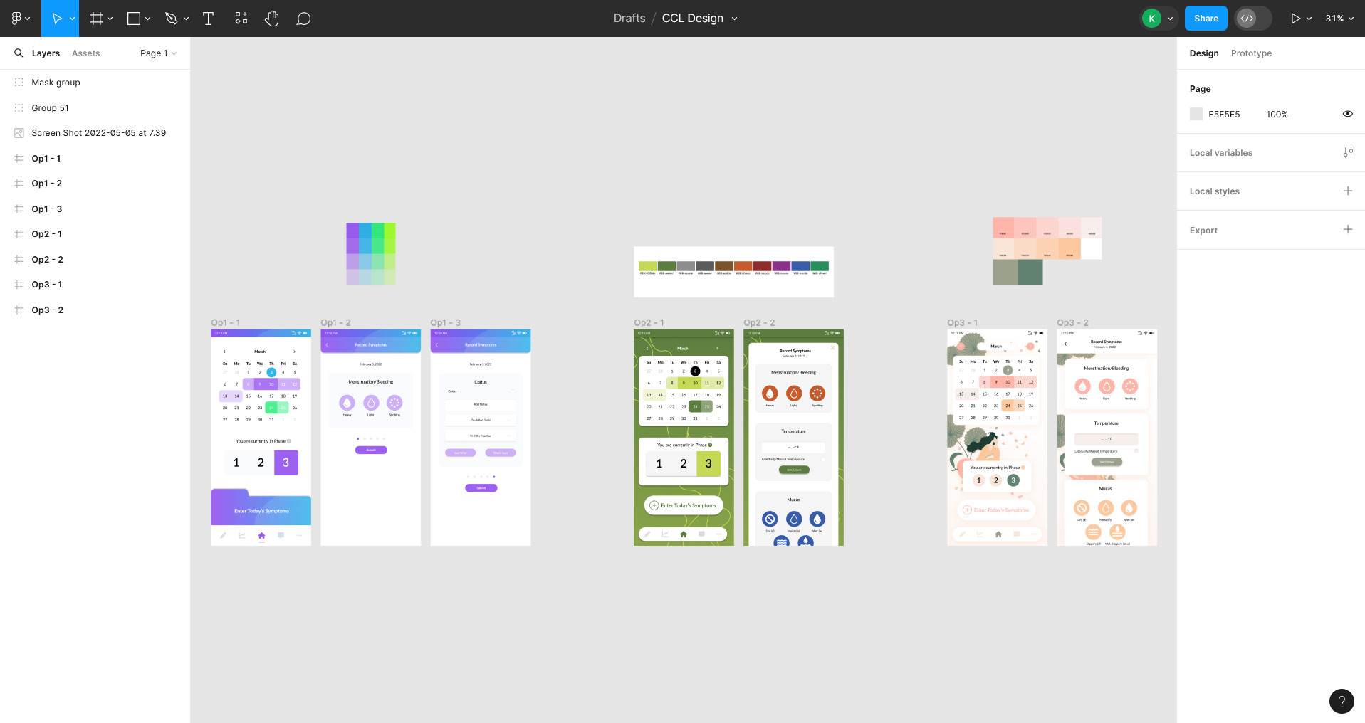
I created multiple designs based on the client’s requests. CCL was initially unsure of what kind of design they wanted to go with. They liked the idea of utilizing green in the design. As such I decided that I would showcase a few different ways that design could change the overall impression of the app.
The first design (left) I went with something that had more of a “clinical” look and feel. Since they are more of a medical app, focusing on helping women get pregnant, rather than solely a period tracker, they wanted at least one design that felt like it would fit in the medical field.
The second (middle) I went with the existing color palette that CCL was using on their current app. CCL had said that they were not invested in keeping this palette but that they wanted to see something in those colors. They wanted me to focus on the greens.
The third design I created was the design I knew they would actually want. Based on everything they were telling me during our meetings they were more interested in connecting to users in a friendly, warm way, rather than going with something clinical, and I also knew their existing color palette was not going to give the look/feel they wanted.
They loved the third design so much, they requested that I create some additional iterations based off of that design in a few different color palettes. They also requested I revise the second design, but use the green of the third design rather than their color palette.
Ultimately they went with the third design as it was the best balance of both sophistication and warmth, while reaching their target audience.
Getting to the heart of what my client actually wants...
When diving into the initial design phase the client was very clear that they did not want to use pink in the design. They did not want the design to appear to “girly.” This is a sophisticated company, geared towards women moing into the next phase of their life, not young girls.
I understood why my client had requested no pink, but I wanted to create a design in pink anyway, since I knew it would work better on the existing market than green as they were requesting. I also knew that I could create a design that was both sophisticated AND feminine.
When I disagree with a client in this way, when I think I have a better idea of what the client ACTUALLY wants, or when I know that a certain design will work better in their target market, I approach this by creating it as my 3rd or 4th design iteration. I create the designs requested, and then in my final design I create the one they ACTUALLY want.
This client almost always chooses my preference.
High Fidelity Mockups
I cannot share the full design hifi, but have pulled a few of the most important pages with the okay of the client.
In order to make the color palette more sophisticated than your average pink color palette I oped for an orange/pink scheme rather than an entirely pink scheme. The greens help balance out the orange and create something really beautiful and warm.
The color palette is diverse enough to be able to use for styling many different types of alerts and buttons throughout the app.
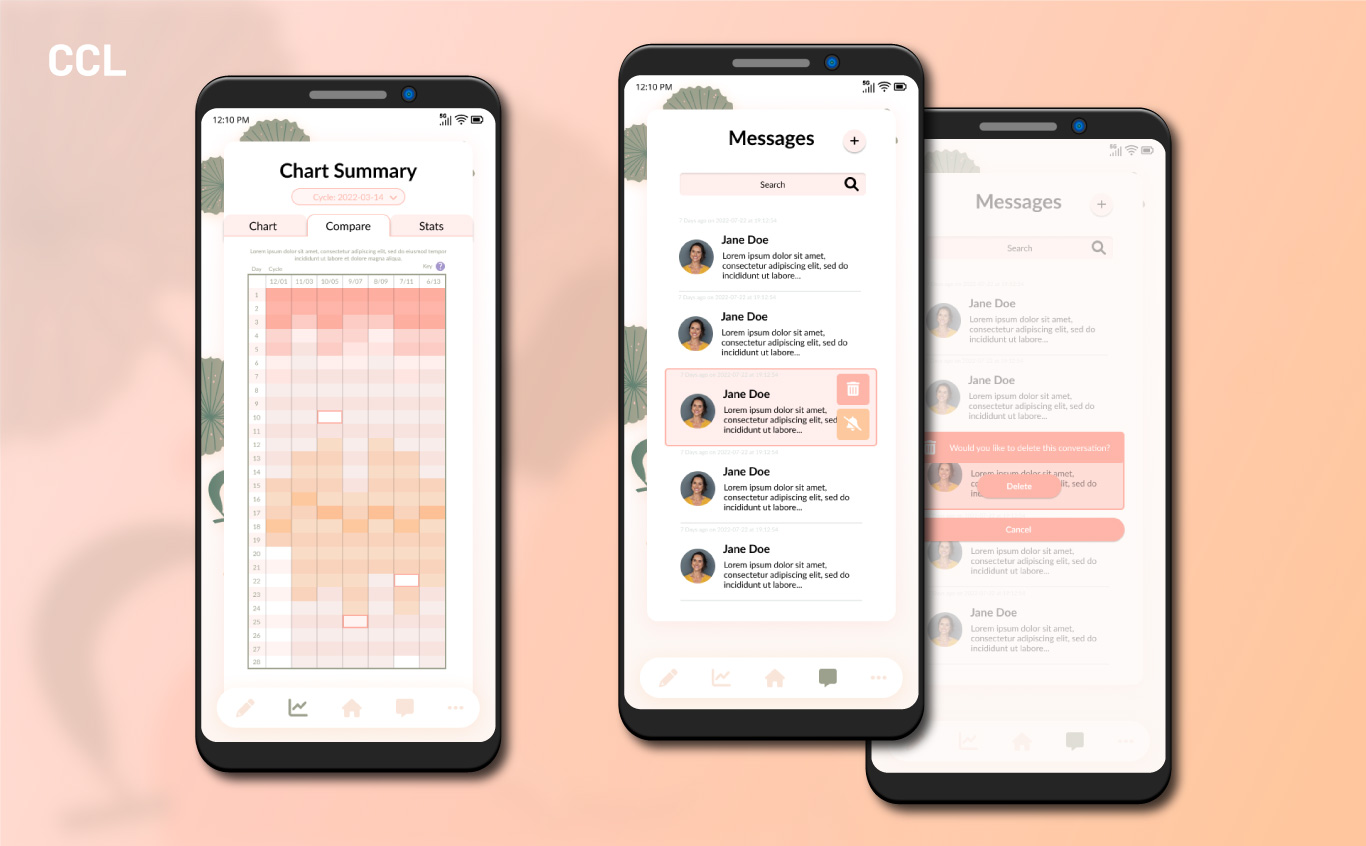
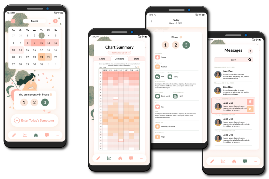
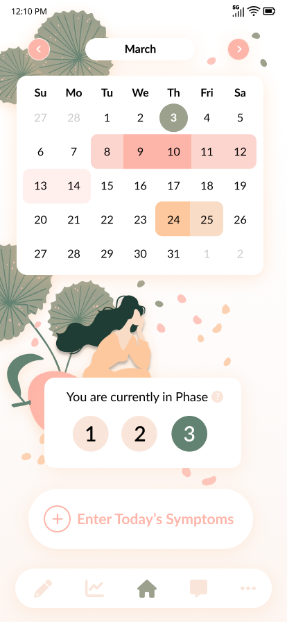
The most important element, and the element we started with was the homepage and period tracking form itself.
On the homepage the calendar needed to have several different color options with different meanings for each one. In a normal period tracker there might only be the colors for the current day and then for the period itself, with slight variations for light/regular/heavy bleeding. I included all three colors in the pink variation. For this app we also needed to include ovulation days so that those trying to get pregnant or trying to avoid pregnancy could get that additional functionality. I opted for the orange color to help differentiate it from the menstrual cycle. The current day I changed both shape and color to differentiate it from the other elements.
The phase tracker was the next most important element for those trying to get pregnant. It can be turned on/off in the settings depending on the user, since those using this as only a cycle tracker will have little use for the phases.
Below that it was important that the tracking was easy to access from the homepage since that was the primary functionality of the app. So I created the button “Enter Today’s Symptoms.” The client requested the wording of this button, so I tried to make it as clear as possible that it was a button and that it was important on the homepage.
Designing for Two Distinct User Profiles...
One of the biggest concerns of this design was to balance the two most important user profiles: pregnant women and women not wanting to be pregnant.
These polar opposites both utilize a period tracking app like this to make sure they meet their goals. CCL wanted to make sure neither group felt called out or left out by the app.
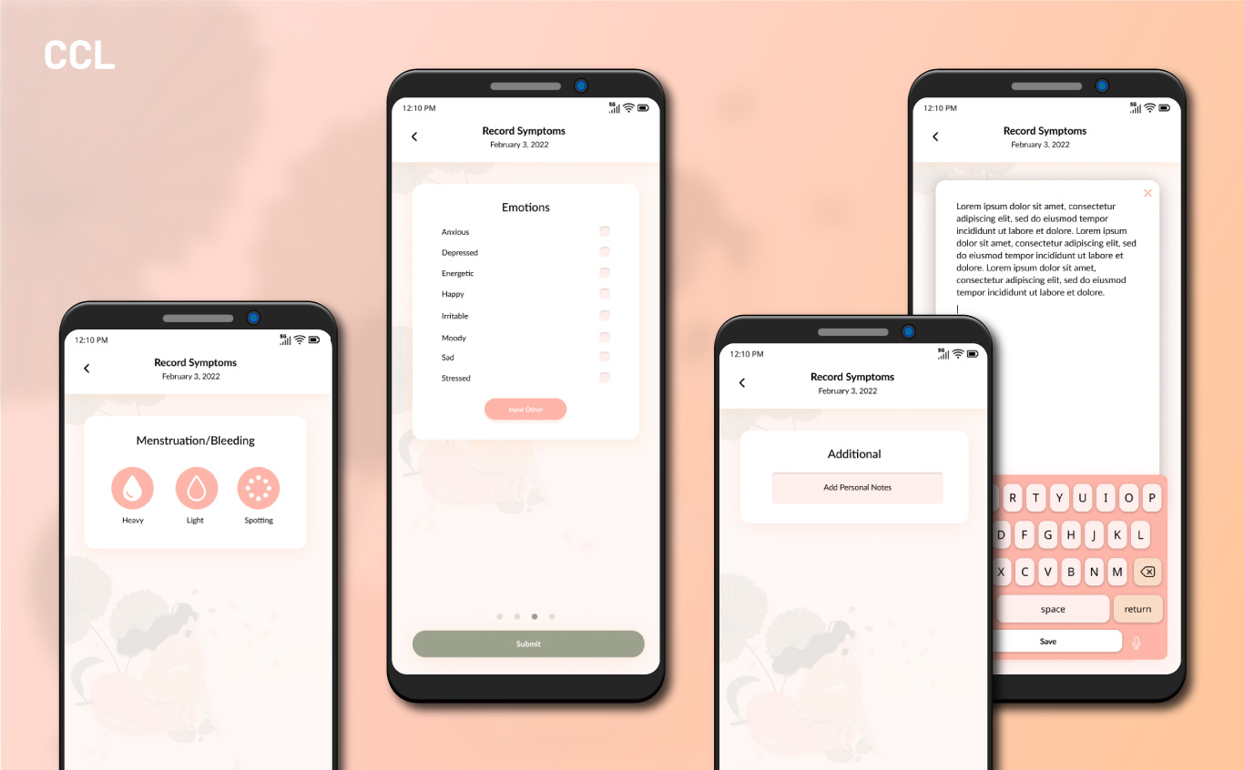
To help us with this goal we revised the symptom tracker to be able to turn on/off symptoms so that women who did not have need of specific info did not have to look at it every day.
We also made sure that the design did not feature children, partnership, or pregnancy anywhere, even where symbols were used.
Conclusions
Overall the design is a beautiful balance of femininity while remaining sophisticated, warmth while retaining utility, and comfort while not being generic.
The design stands out from the competitors using a unique look. It connects to its target audiences with its feminine, but not juvenile color palette and styling.
For those using it as a period tracker it is a beautiful app that tracks everything you could need. For those using it as a ovulation tracker it has all the functionality and depth that a client could want.
It succeeds in its goals.