Product Design
Designing a Better
Financial Dashboard
For Complex Data
Viridian Capital Advisors had been tracking complex financial data for years in a newsletter form and needed a better way to showcase data. This required both finding ways to better showcase complicated data so that it was easier to understand, but also creating a high quality user experience that made moving from a newsletter worthwhile to customers.
Overview
Viridian Capital Advisors wanted to offer their data in an easier to understand with the goal that their clients who had received this data for years free through their newsletter would see the value in transitioning to a platform that could scale with the companies data needs.
My Role
- Lead Product Designer
- Strategist
- UI/UX Design
The Team
- 2 Project Managers
- 4 Developers
- 1 Content Strategist
- 4 Stakeholders (Client)
Sector
- Finance
- FinTech
- SaaS
- Data
Deliverables
- User Flows
- Wireframes
- Prototypes
- Design System
- HiFis
Tools
- Figma
- Miro
- Notion
- Figjam
Vision and Goals
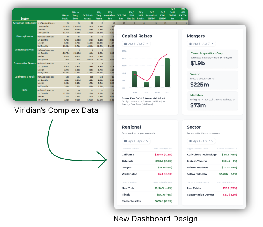
The existing data is complex and difficult to understand, especially at a glance.
- Displaying data using better heirarchy on a clean, focused platform would reduce user confusion and strain.
The platform needs to have value to convince users to move from the free newsletter
- Clarity in value offerings, integrating interactivity with the data, live updates and ability to adjust data, discovery of other offerings for Viridian, app needs to work on all screen sizes.
The platform will grow and needs to be future proof.
- Create a clean, modern design that can stand the test of time. Focusing on user journeys will reduce strain longterm.
Discovery
Compiling data from the newsletter, Viridian clients and staff, we crafted user personas and formed a group of testers to iterate towards the dashboard product. Competitor analysis of financial dashboards from leading competitors
Stakeholder Workshops
To align on goals, user needs, and business strategy for Viridian’s market insight and data tracking app, we conducted a series of stakeholder workshops using IBM’s Enterprise Design Thinking framework. These sessions brought together leadership, analysts, and client-facing teams to surface assumptions, define priorities, and co-create a shared vision of success.
- Hills: Defined user-centered goals from the perspective of what success looks like (e.g., “A cannabis operator can compare market share across three states in under 5 minutes”).
- Empathy Maps: Helped the team understand what users think, feel, say, and do, aligning internal perspectives with real-world user behavior.
- Stakeholder Map: Identified key internal and external influencers and decision-makers across product, data, and client services.
- Prioritization Grid (Impact vs. Effort): Ranked features and ideas based on business value and technical feasibility.
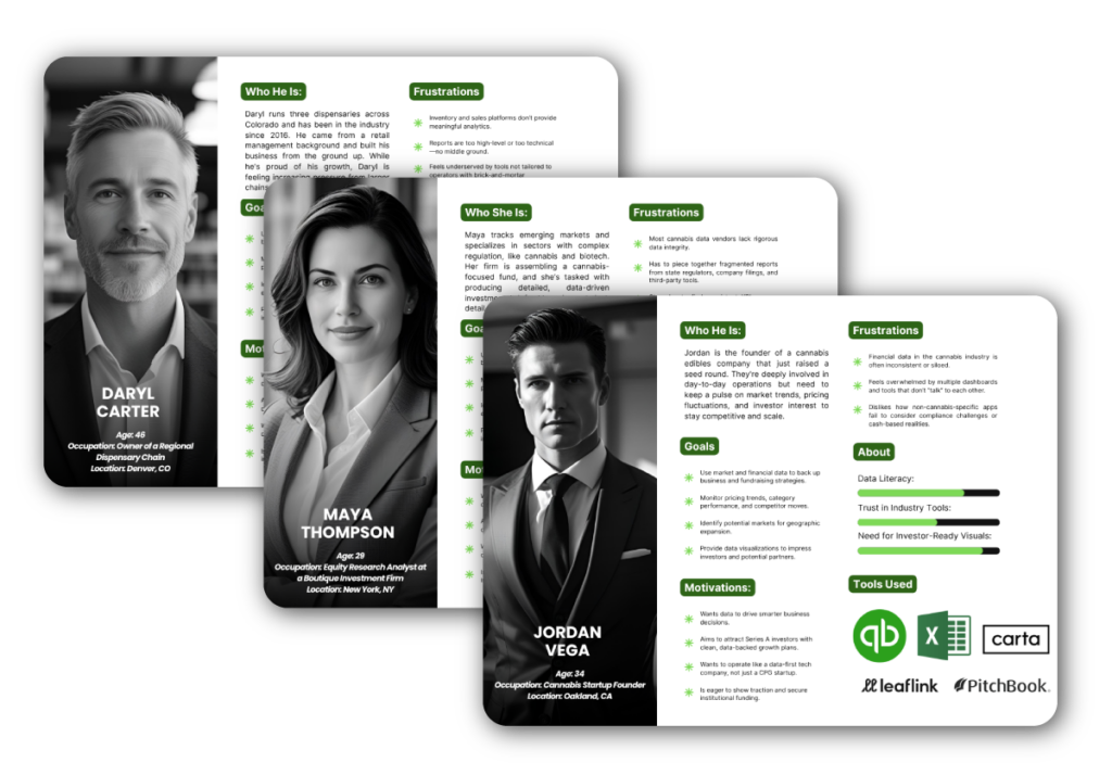
User Personas
We uncovered three primary user groups for Viridian’s market insight and data tracking app:
- Founders seeking investor-grade metrics to drive growth
- Analysts needing reliable, customizable data for financial modeling
- Dispensary operators looking for quick, actionable insights to stay competitive
Each persona revealed distinct needs and common frustrations with fragmented, outdated, or overly generic tools. These insights suggest the need for a tailored experience that balances depth, clarity, and industry-specific relevance.
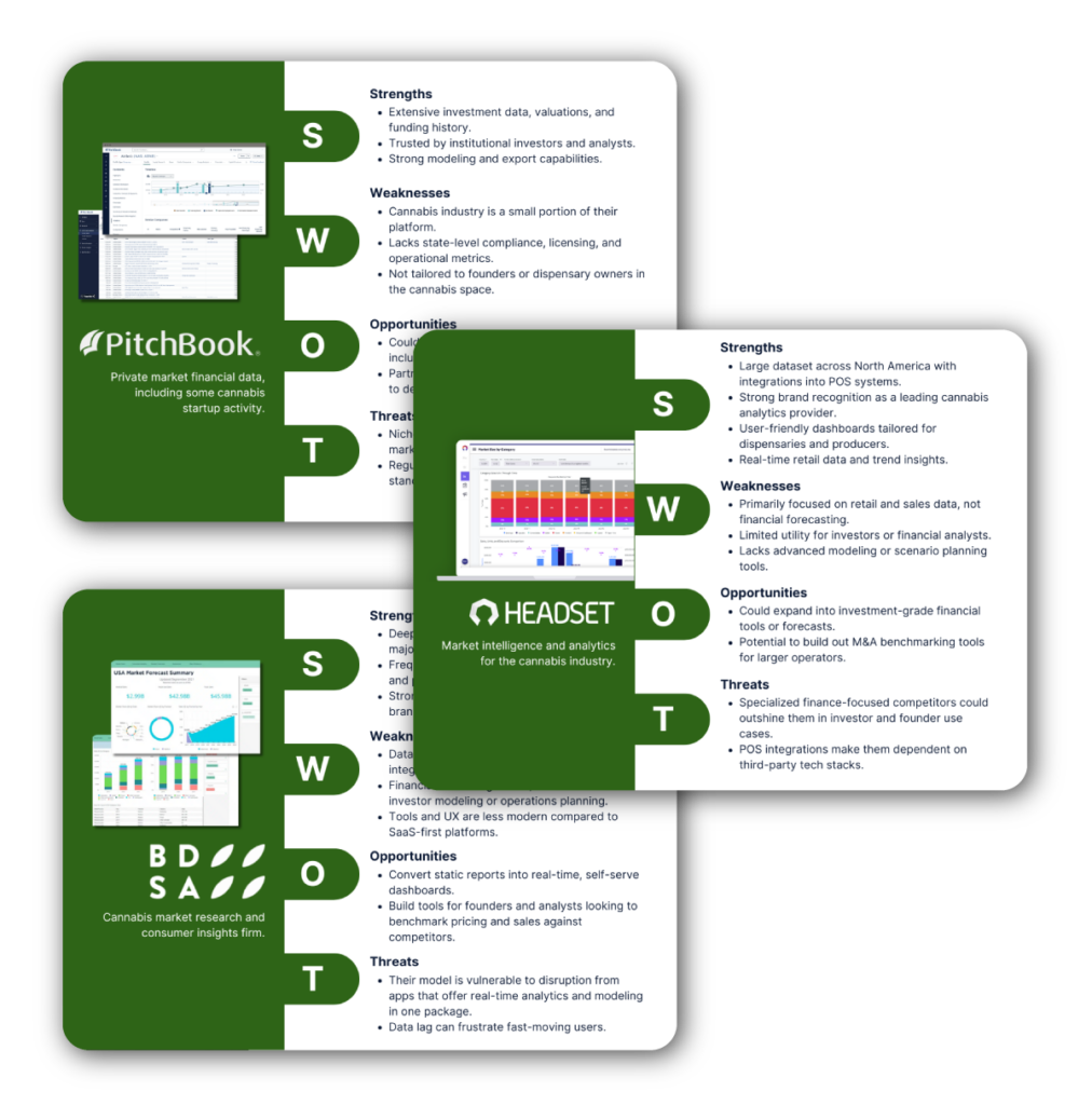
Competitor Analysis
- The biggest competitors both directly and indirectly were idetified by stakeholders
- A SWOT analysis of each competitor was conducted
- Audits of the most similar and largest competitors was conducted to to learn touchpoints, pricing, trials, upgrades, UI Design, user journeys and pain points
- Reviews of competitor products were found to discover user perspective of product use
The competitor analysis revealed a significant market gap between retail-focused cannabis data platforms and institutional-grade financial tools.
While platforms like Headset and BDSA excel at tracking sales data, they lack investor-centric tools, and strategic modeling capabilities that Viridian’s audience requires. However, platforms like PitchBook offer financial data but lack industry-specific regulatory context.
Viridian could uniquely position itself by merging actionable financial intelligence with industry-specific market tracking. The focus should be on offering insights that are timely, trustworthy, and tailored. We also identified key product opportunities, including customizable benchmarking, real-time M&A tracking, and predictive analytics for regulatory impact.
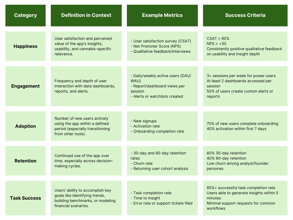
Defining Success
We used a HEART approach to define success metrics, framing growth through delivering a highly usable, insight-rich experience that keeps users engaged and returning.
Users value clarity, speed to insight, and cannabis-specific financial relevance, which means the app must prioritize intuitive dashboards, customizable alerts, and easy-to-generate reports.
High engagement and retention will stem from empowering users, especially analysts and founders, to accomplish key tasks like benchmarking, forecasting, and market tracking with minimal friction. Ultimately, the app must not only provide accurate data but make that data actionable and easy to access, reinforcing daily and strategic decision-making.
Ideation
Utilizing the compiled data, the beginnings of the product started taking shape. We heavily focused on the users needs to find the best organization for the app and each page.
User Flows
We uncovered three primary user groups for Viridian’s market insight and data tracking app:
- Founders seeking investor-grade metrics to drive growth
- Analysts needing reliable, customizable data for financial modeling
- Dispensary operators looking for quick, actionable insights to stay competitive
Each persona revealed distinct needs and common frustrations with fragmented, outdated, or overly generic tools. These insights suggest the need for a tailored experience that balances depth, clarity, and industry-specific relevance.
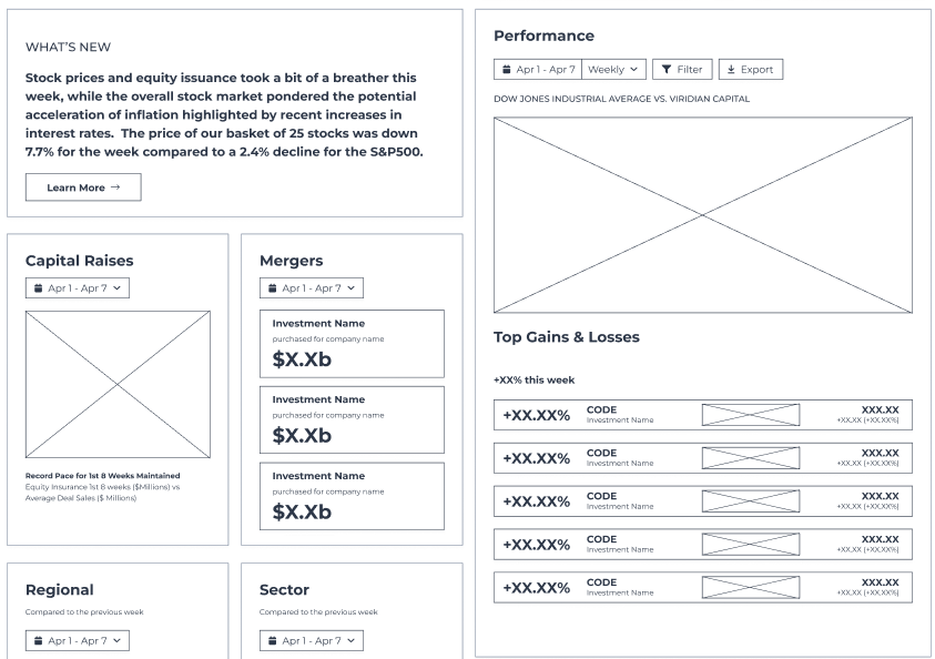
Wireframes
To get the pages organized, wireframes were created for each element. We then checked these wireframes with the stakeholders to ensure no important information was missed.
We also used these for a/b testing and card sorting among user groups to make sure that the organization on each page was the best for the users.
Design System
- The biggest competitors both directly and indirectly were idetified by stakeholders
- A SWOT analysis of each competitor was conducted
- Audits of the most similar and largest competitors was conducted to to learn touchpoints, pricing, trials, upgrades, UI Design, user journeys and pain points
- Reviews of competitor products were found to discover user perspective of product use
The competitor analysis revealed a significant market gap between retail-focused cannabis data platforms and institutional-grade financial tools.
While platforms like Headset and BDSA excel at tracking sales data, they lack investor-centric tools, and strategic modeling capabilities that Viridian’s audience requires. However, platforms like PitchBook offer financial data but lack industry-specific regulatory context.
Viridian could uniquely position itself by merging actionable financial intelligence with industry-specific market tracking. The focus should be on offering insights that are timely, trustworthy, and tailored. We also identified key product opportunities, including customizable benchmarking, real-time M&A tracking, and predictive analytics for regulatory impact.
Design
Designs were created in Figma utilizing Material 3 as a base for the design system.
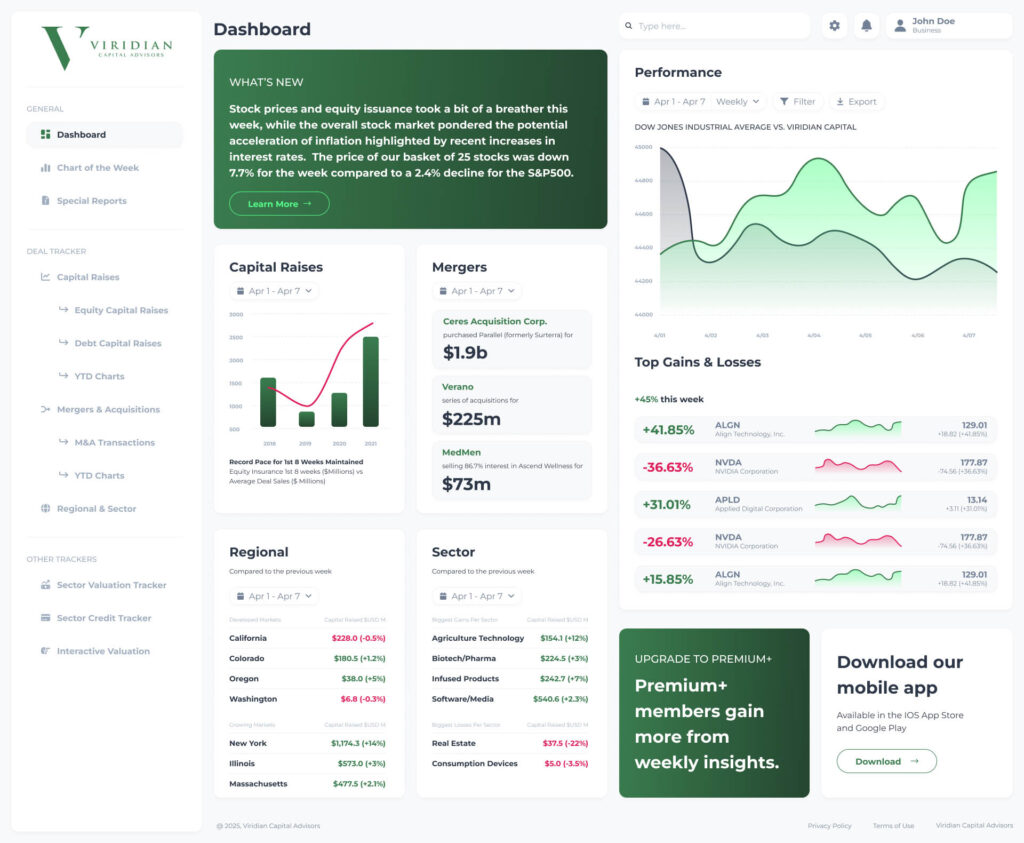
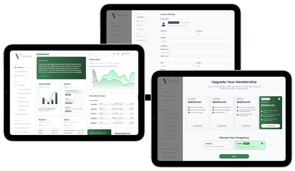
HiFi Designs
The finalized design’s goal was to more easily understand the data. With this in mind we focused on utilizing whitespace to help the data itself stand out. We highlighted areas where we wanted users to look first, making both the what’s new section and the upgrade section contrast the rest of the design to pull the eye.
Understanding users already have associations with red as negative and green as positive, we could pull that into the design to help the data be easier to read at a glance.
We left the initial design of the data, as it was difficult to read and understand. We instead put only the most important data upfront, increased legibility and hierarchy throughout the design.
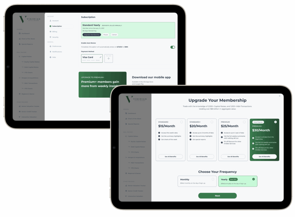
Feature - Upgrade Membership Flow
A major sales goal for Viridian was to help users upgrade their plans from the free version. I focused on different ways to help users understand the benefit of upgrading their membership, but also more opportunity to upgrade.
- A focus on CTAs on each page. The goal was to make then eyecatching and focus on different features of the premium memberships
- A clear upgrade page that outlined the benefits of each plan, and pushes users toward the more expensive membership as the recommended plan.
- A push to yearly membership options to help reduce turnover rates
Feature - Investor-Grade Financial Dashboards
We uncovered three primary user groups for Viridian’s market insight and data tracking app:
- Founders seeking investor-grade metrics to drive growth
- Analysts needing reliable, customizable data for financial modeling
- Dispensary operators looking for quick, actionable insights to stay competitive
Each persona revealed distinct needs and common frustrations with fragmented, outdated, or overly generic tools. These insights suggest the need for a tailored experience that balances depth, clarity, and industry-specific relevance.
Feature - Customizeable Alerts and Watchlists
We uncovered three primary user groups for Viridian’s market insight and data tracking app:
- Founders seeking investor-grade metrics to drive growth
- Analysts needing reliable, customizable data for financial modeling
- Dispensary operators looking for quick, actionable insights to stay competitive
Each persona revealed distinct needs and common frustrations with fragmented, outdated, or overly generic tools. These insights suggest the need for a tailored experience that balances depth, clarity, and industry-specific relevance.
Reflection
From our KPIs we were able to gauge the effectiveness of the new design. In areas of happiness, engagement, adoption, retention, and task success we improved the app. The overall project was a success.
Conclusion
We gauged feedback from our user groups to define success for the project.
- In happiness we received consistent improvement in both the CSAT and the NPS scores.
- In engagement we noticed an improvement in sessions per week that outpaced the expected success criteria. The goal was 3+ and we noted an average of 4+ sessions.
- For adoption the initial users completed onboarding at a 70% rate, successfully meeting our adoption metric.
- For retention we noticed a 60% retention after 30-days. There was very little churn among our founder personas.
- For task success we noticed insights were able to be generated by users in less time than our expected success metric.
Overall the project proved to be an incredible success. The design fit all the needs that Viridian needed out of a financial dashboard, while also being modern and clean.